How to Create a Welcome Email for a Challenging Audience
Welcome emails are the first point of communication with a user, making it crucial to leave a good impression on subscribers. This task becomes significantly more challenging when the recipients are children.
While the main difficulty with adult audiences is getting them to open emails due to the overwhelming number of messages they receive, the challenge with emails for children is the lack of content that is suitable and engaging for them.
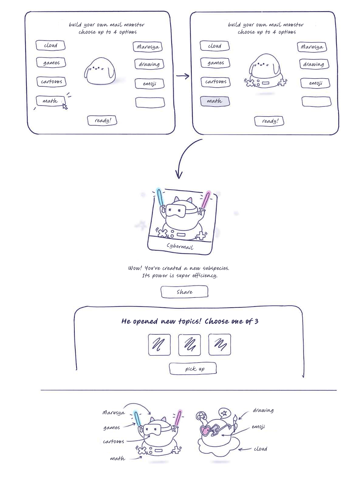
Therefore, for the Kids' Mail service, together with VK, we decided to create a welcome email sequence featuring content in a playful format. The main idea is to present the available services in such a way that children can build their ideal mail experience on their own.
Concept Development
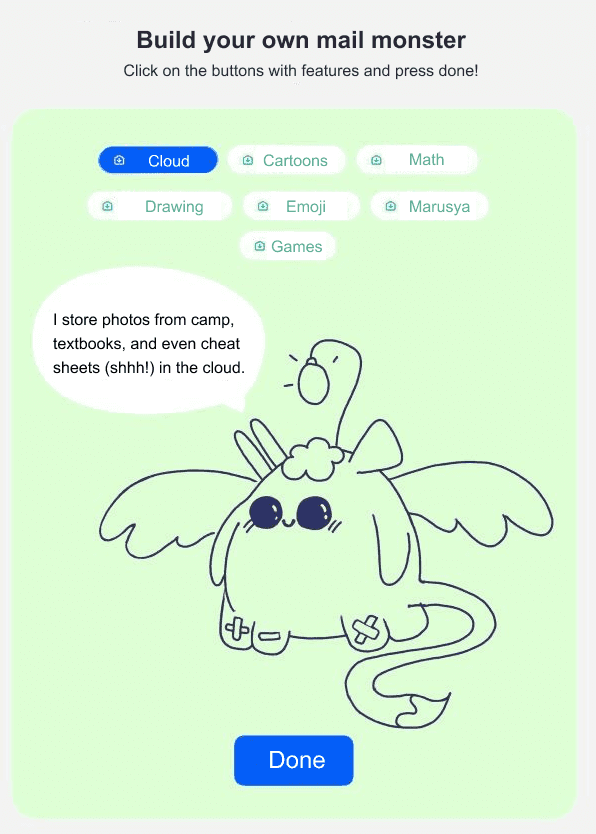
Just before we started working on the project, Kids' Mail updated its branding and introduced new mascots — cute little monsters. We decided to give users the chance to create their own "mail monster."

As we developed this concept, we also decided to introduce young subscribers to each of the services by giving a brief overview of its key features. When you click on a service, a description bubble appears.

At this stage, Mail's design team had already worked out the visual appearance and main features of our mail monster.
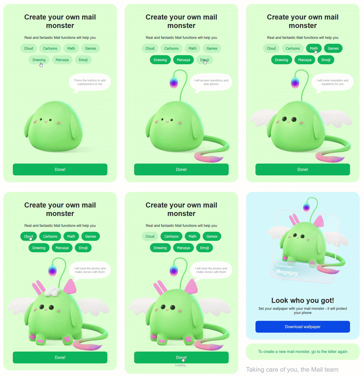
The monster turned out to be so adorable that we came up with another idea — to allow users to save the image they created and use it as, for example, a phone wallpaper.
A Few Technical Details
Naturally, to implement such an interactive email, we could only use AMP. Since the email is primarily targeted at mail.ru users, the majority will see the interactive version.
To ensure proper rendering and speed up the process, we used the TJML framework. Regarding the specifics of AMP interactivity, each service had its own state, which was set to either 1 (active) or 0 (inactive). Depending on the state, we would show or hide a particular layer (such as a tail, ears, eyes, etc.).
To track which services were most popular among children, when creating the monster, we also generated a form that collected the selected services and, upon clicking "done," sent the data to Pixcraft.
In the final step, we show a picture of the monster with its name. There’s a small technical detail worth mentioning here. The issue is that mail.ru doesn't work with default states, meaning that the following type of entry will be ignored:
1 2 3 4 5<amp-state id="names"> <script type="application/json"> ["Tsifrosh", "Servicio", "Filer", "Otpravita", "Megaguy", "Mailia", "Chernover"] </script> </amp-state>
At the same time, this would have worked correctly in Gmail.
The universal solution in our case was to assign an array of possible names directly to the span, referring to a random element of the array:
1<span [text]="['Tsifrosh', 'Servicio', 'Filer', 'Otpravita', 'Megaguy', 'Mailia', 'Chernover'][floor(random() * 7)]"></span>
Phone wallpapers were also tricky. With 7 available services, it was possible to create 128 different monster combinations. Manually generating all of these would have taken a lot of time, so we wrote a small program to generate all the possible variants automatically.

Statistics
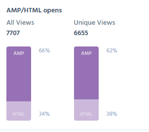
After launching the email, we collected and analyzed the statistics over a month. Since we are talking about AMP emails, the first thing to note is the percentage of AMP opens:

For unique opens — 62% for AMP, 38% for HTML. For non-unique opens — 66% for AMP, 34% for HTML. The conversion rate for submitting the form (clicking the "done" button) was 19.9% of those who opened the email. This indicates that users returned to the AMP emails multiple times, reopening them to create different monsters, meaning the goal of capturing users' interest was definitely achieved.
We also analyzed which services for kids were the most popular and in-demand, and the results showed the following picture:
| Cloud | 44.29% |
| Cartoons | 46.20% |
| Math | 44.85% |
| Games | 49.52% |
| Drawing Tool | 50.43% |
| Marusya | 44.60% |
| Emoji | 49.92% |
However, it's likely that kids were choosing the features they found most visually appealing for their monster, rather than the services that genuinely interested them. It's no surprise that the "Drawing Tool" was added by over 50% of the subscribers, as it added a cute brush-tail. "Emoji," selected by nearly half, gave the monster adorable eyes, and "Games," which were close in popularity, added wings.
Conclusion
This level of detail in the welcome emails allows us to build a trusting relationship with the audience from the very start. We paid great attention to small details, carefully crafted the content, and genuinely aimed to make the communication process enjoyable for children. This approach helped us achieve excellent results.
A significant part of this success was due to the PixCraft platform. It made it quick and easy to create high-quality email templates and supported the backend functionality of the AMP emails.
