How to Use Branding in Email Templates to Create a Recognizable Style
When opening an email, the recipient should instantly recognize who it's from. A familiar style—consistent colors, fonts, layout, and tone—makes the email feel recognizable and trustworthy. If each email looks different, the brand gets lost among other messages.
To prevent this, email templates should reflect the brand’s identity by defining colors, visual elements, and structure. This article covers how to make email campaigns recognizable and what to consider when designing templates.
Why Branding Matters in Email Campaigns and Key Elements to Use
Branding in email campaigns serves several purposes:
- Builds trust — A consistent style makes emails feel familiar and less like spam.
- Improves readability — A clear and structured design helps users process information faster.
- Makes emails memorable — A cohesive design helps users recognize the brand, even without a logo.
Essential Branding Elements for Emails
To make emails look professional and recognizable, templates should include key branding elements:
1. Logo. The logo is the primary visual identifier of the brand. It should be:
- Placed in the header or another prominent spot.
- Large enough to be noticeable but not overwhelming.
- High-quality and with a transparent background to display correctly, including in dark mode.
![]() The Taste of Home email features a prominent yet unobtrusive logo.
The Taste of Home email features a prominent yet unobtrusive logo.
2. Brand Colors. Consistent colors visually connect emails to the website and other brand channels. Key recommendations:
- Use 2–3 primary brand colors and stick to them.
- Make CTA buttons stand out with contrasting colors.
- Test how colors appear on different screens and in dark mode (some shades may become less visible).
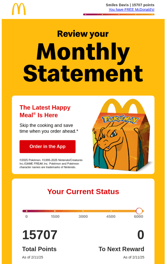 McDonald's sticks to its brand colors, making the sender immediately recognizable.
3. Fonts. Email text should not only be readable but also align with the brand’s style. Key considerations:
- Use fonts from the brand book (if they are suitable for emails).
- Choose "safe" fonts that display correctly across different email clients.
- Highlight headlines and buttons with accent fonts or styles, but avoid overloading the layout.
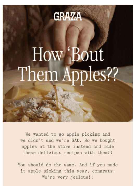 Graza uses familiar fonts here.
4. Visual Style. Images, illustrations, and icons all influence how the brand is perceived in emails. Tips:
- Maintain a consistent image style (e.g., only illustrations or only photos).
- Avoid clutter—visuals should complement the content, not distract from it.
- Optimize image sizes to prevent slow email loading.
 Headspace, for example, uses illustrations.
How to Maintain a Consistent Style with Components and Variables
Manually designing each email increases the risk of small but important inconsistencies—colors might slightly vary, fonts may change, and buttons could look different. This disrupts brand consistency.
To prevent this, define key template elements in advance:
- Set brand colors as variables to avoid manually entering color codes.
- Standardize fonts and sizes for headings, body text, and buttons.
- Keep buttons uniform in color, corner rounding, and text style.
Another important detail is the template structure. It's essential to define which blocks are consistently used in emails—header, footer, product cards, promo sections. Turning these into components allows for easy copying without unnecessary edits.
Email Guidelines in Figma: Why You Need Them
Even with well-defined elements, different team members might use them inconsistently. To prevent this, an email guideline in Figma can be helpful.
It should document the key styles: which fonts, colors, and elements are considered part of the brand and should remain unchanged. It should also include ready-made components for quick use in new emails and example templates with notes on how to adapt them for different campaigns.
With this approach, marketers can quickly assemble new emails without breaking the style, while designers can make centralized updates without manually adjusting each template.
How to Keep Emails Recognizable Without Becoming Repetitive
If emails always look the same, they may stop catching attention over time. But if each email has a drastically different design, brand recognition suffers. The key is finding a balance—sticking to the brand style while keeping the content fresh.
Adding Variety Without Losing Consistency
Brand colors can be used flexibly. For example, the background color might change slightly for holidays—darker shades for Halloween, for instance. The important thing is to stay within the brand’s main color palette.
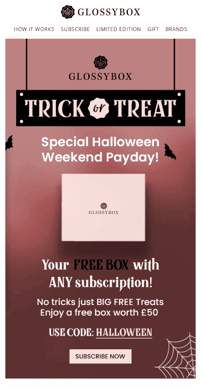 Glossybox used a darker color palette than usual, but the brand remains recognizable.
The arrangement of email sections can also vary. Some emails might start with a large banner, while others jump straight into an offer. This keeps emails engaging without disrupting their structure.
A great way to refresh the design is by adding seasonal details. For example, a Christmas email could feature a background pattern of ornaments or holiday-themed illustrations.
Playing with the Logo and Other Brand Elements
The logo is also an area for creative tweaks. For holidays, a small accent—like a snowflake for New Year’s, a pumpkin for Halloween, or a themed gradient—can add a festive touch without breaking brand consistency.
![]() Apple added a festive touch to their logo.
Apple added a festive touch to their logo.
Icons, illustrations, and button shapes can also be subtly adapted to match a specific theme. The key is to keep changes cosmetic rather than drastic. This keeps emails fresh and engaging while maintaining brand recognition.
How to Maintain Brand Consistency in Dark Mode
Many users read emails in dark mode, and if an email isn’t optimized for it, it might look off—bright brand colors can become overly neon, while pastel shades may appear too faded.
What to Do:
1. To ensure emails look as intended, set alternative colors for dark mode using CSS or choose shades that work well on a dark background. Planning for both light and dark themes from the start helps maintain brand consistency.
2. In dark mode, bright white text on a black background can strain the eyes. A softer shade, like light gray, works better. Also, check button visibility—dark text on a dark button might disappear completely.
3. Dark logos and icons may blend into dark backgrounds. To prevent this, place the logo on a white background instead of a transparent one.
![]() A dark blue logo disappears against a dark background in dark mode.
A dark blue logo disappears against a dark background in dark mode.
4. Different email clients handle dark mode differently, so testing in Gmail, Apple Mail, Outlook, and other services is essential. If the email looks good across all platforms, the brand style remains intact regardless of screen settings.
For quick dark mode previews, try the Pixcraft email generator. Try it for free.
Conclusion
Branding in email templates makes a campaign not just visually appealing but also recognizable. When colors, fonts, images, and email structure follow a consistent style, subscribers instantly identify the sender and trust the content. The key is balancing consistency with variety—sticking to brand guidelines while making small tweaks to keep the design fresh. This way, emails remain stylish, recognizable, and engaging.