Developing a Guideline in Figma: Components, Variants, and Variables
Guideline (or Design Guide) is a document that helps maintain consistency and uniformity in design. It defines how repeating elements should look, which styles to apply, and how to correctly use ready-made components. Figma is the most suitable tool for creating email template guidelines for newsletters. With its features (components, variants, instances, variables, etc.), Figma simplifies working on email templates and speeds up making edits.
This article explores components, variants, and variables in Figma and how they can help create a cohesive guideline.
What is a Component?
A component is a template for an element whose copies (instances) can be used in different parts of a project. Any changes made to the component will automatically update all its instances. You can create a component from the context menu when selecting an object, group, or frame, or by using the shortcut Ctrl + Alt + K.
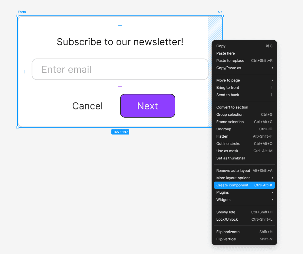
Components make it quick and easy to add elements to a layout while maintaining a consistent style and design approach. They are also a fundamental part of any guideline. First, new elements created from a component will preserve the project's design consistency. Second, if you need to update the structure of an element in your guideline, you only need to edit the component, and all its instances will automatically reflect the changes.
Component libraries, as well as project-specific components, are available in the Assets panel. You can use both local components created within your project and components from linked libraries.
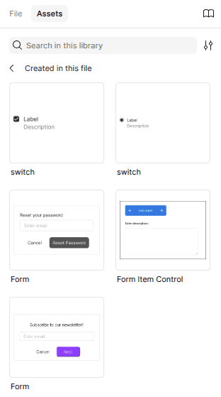
Components are usually stored in a separate project file. This allows all team members to quickly access these elements with predefined size, positioning, and style settings.
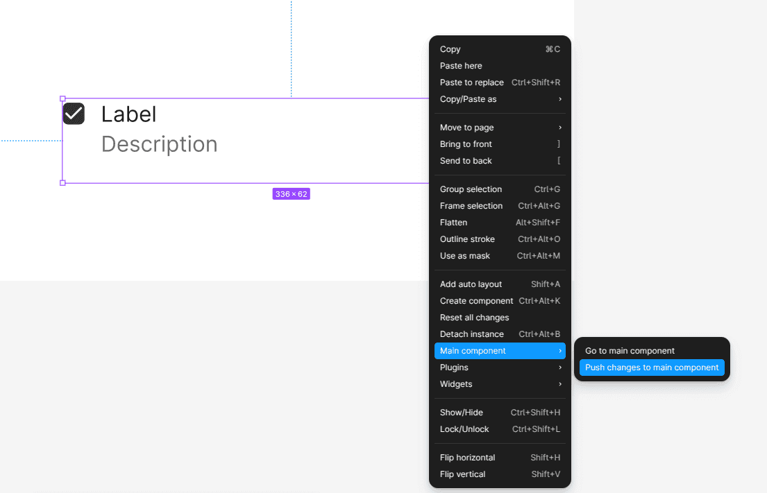
You can always navigate from an instance to its main component by right-clicking any copy and selecting Main component – Go to main component. In the same menu, you can also push instance changes to the main component.
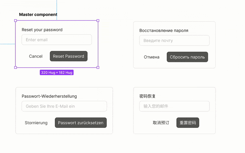
Component Instance
An instance is a copy of a main component that inherits its properties but can be partially modified. Instances allow you to override content such as text, images, and colors while maintaining a connection to the original component.
How Instances Work
- If you edit the main component, all instances will update automatically.
- If you modify an instance, the changes apply only to that instance and do not affect the main component.
- If you detach an instance, it becomes a regular object and loses its link to the component.
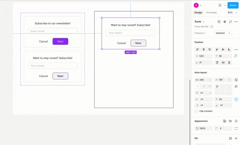
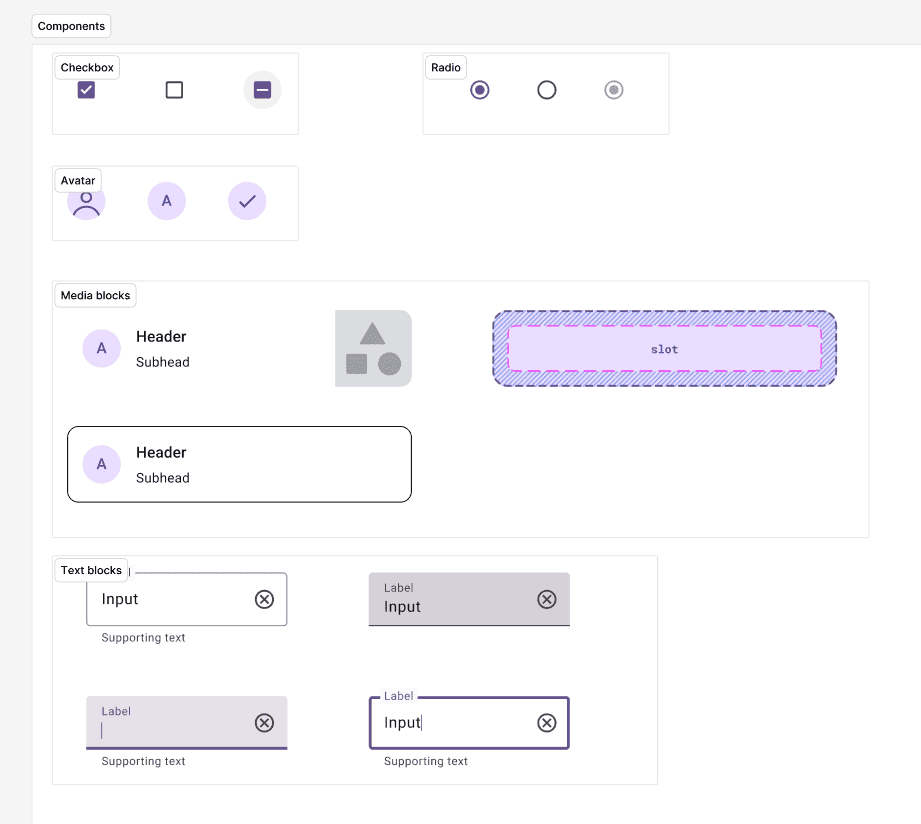
Component Variants
When designing a guideline, you often need to display multiple states of the same interface element. For example, a button may have a default, disabled, pressed, or hovered state. While you could create a separate component for each state, this approach leads to structural redundancy, complicates maintenance, and makes the design process less efficient.
To address this, Figma provides variants, allowing you to group multiple states within a single component.
Variants enable you to combine multiple components with different states or properties into a single component with toggleable parameters. Instead of creating multiple separate components (e.g., a button in different states), you can use a variant component with switchable properties. Variants also improve navigation in the Assets panel.
It's important to note that a component variant is not a full-fledged instance, meaning changes between variants are not synchronized.
To add a new variant, right-click the main component and select Main component – Add variant. In the future, you can add new variants directly in the project workspace:
Nested Components
Components can also be used inside other components, allowing you to modify specific elements directly within an instance.
The easiest way to manage nested components is by using Properties.
Component Properties
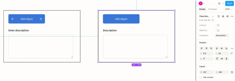
When your project contains only a few different elements, working with component variants is convenient. However, if you need to configure multiple elements—such as numerous input fields with different states—it’s more efficient to use component properties.
Component properties allow you to adjust component instances without changing their structure. They offer more flexibility than variants and make components more versatile.
Managing a single component with multiple properties is the most complex approach, but it’s also the most universal, efficient, and space-saving. By eliminating the need to handle each variant separately, designers can significantly streamline their workflow.
Figma offers four main types of properties:
- Text Properties.
- Boolean Properties.
- Instance Swap Properties.
- Variant Properties.
Let's go over each in detail.
Text Properties
These allow you to edit text within a component directly in the Design panel without breaking its connection to the main component. This type of property makes it easy to customize text fields in any instance.
How to create:
1. Select a text layer inside the main component.
2. In the right-hand panel, find Content and click Create Property.
3. Name the property (e.g., label).
After this, you’ll be able to edit the text content of that field in any instance directly from the toolbar.
Boolean Properties
These enable toggling elements within a component on or off. The values can be either true or false. Boolean properties are useful for showing or hiding icons in buttons or adding temporary elements (such as a discount badge on a product card).
How to create:
1. Select the required element inside the component.
2. In the Layer panel, click Create Property – Boolean.
3. Name the property (e.g.,show_icon).
Instance Swap Properties
These allow you to swap one nested component for another without breaking the connection to the main component. This is useful for replacing an icon within a button (e.g., icon = arrow – icon = check).
How to create:
1. Select the nested component inside the main component.
2. In the Design panel, find Instance Swap and create a new property.
3. Name the property (e.g., icon_variant).
Variant Properties
These let you switch existing component variants via settings instead of manually selecting them from the Variants panel. For users familiar with component properties, this method provides a more intuitive way to interact with variants.
How to create:
1. Create multiple variants of a component.
2. In the Variants panel, group them and assign properties (e.g., type, state).
Component properties can also be defined directly in the component’s name using the format key=value, key=value. Properties are one of the more advanced aspects of working with components, but mastering them allows designers to create highly flexible and adaptable elements for their templates.
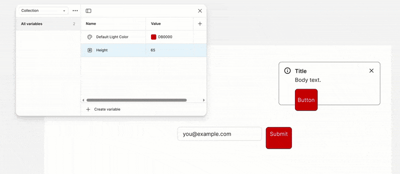
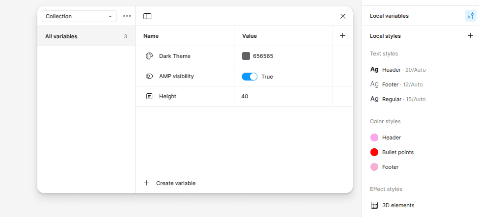
Variables
In addition to components, one of the key tools for building a design guideline is variables. Variables in Figma are values that can be set and reused across different design elements. They make designs more flexible, scalable, and easier to manage, especially in large projects and design systems.
Variables work similarly to CSS variables (--primary-color, --spacing-lg), making it easy to transfer them into code for development. You can configure them in the Design panel by clicking on an empty area of the workspace.
To export variables and styles from Figma as CSS variables, you can use the Pixcraft plugin.
Figma supports four types of variables:
- Color Variables.
- Number Variables.
- String Variables.
- Boolean Variables.
Color Variables
Used to store color and gradient values. They help define:
- Primary and secondary colors
- Text colors (Text-Primary, Text-Secondary).
- Background colors (Background, Surface).
- State colors (Hover, Disabled).
In Figma, these colors can be applied to fills, strokes, shadows, and gradients.
Number Variables
Used to store numeric values such as sizes, spacing, and border radii. Examples include:
- Font sizes (FontSize-Small, FontSize-Large).
- Border radii (Border-Radius, Card-Radius).
- Spacing values (Spacing-XS, Spacing-L).
String Variables
Used to store text values such as button labels or headings. They can be applied to:
- Button labels (Button-Label-Primary).
- Dynamic content (UserName, Product-Title).
- Localization (Locale-EN, Locale-ES).
Boolean Variables
Used to toggle visibility (on/off). Examples include:
- Showing or hiding elements (Show-Icon, Show-Badge)
- Switching between light and dark mode (DarkMode-Enabled).
In Figma, boolean variables control layer visibility.
Также созданные переменные можно группировать в коллекции, например:
- Theme – Light / Dark.
- Spacing – XS / S / M / L.
- Typography – Heading / Body / Caption.
Creating an Email Guideline
Analysis and Planning
At this stage, it's important to thoroughly review existing email templates, identify their strengths and weaknesses, and outline common usage scenarios. Determine which elements need standardization, such as headers, buttons, images, text blocks, and links. Collaborate with marketers, designers, and developers to ensure no crucial detail is overlooked.
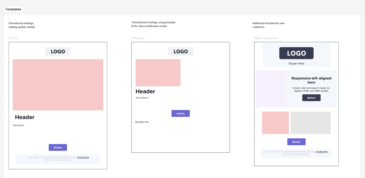
Creating a Design System
A design system establishes a consistent style for all future email templates. It includes colors, fonts, sizes, spacing, and link styles. At this stage, variables and styles will be particularly useful. Styles allow you to centrally manage colors, fonts, and effects for project elements, while variables ensure quick adaptation of designs to new requirements and conditions.
A design system establishes a consistent style for all future email templates. It includes colors, fonts, sizes, spacing, and link styles. At this stage, variables and styles will be particularly useful. Styles allow you to centrally manage colors, fonts, and effects for project elements, while variables ensure quick adaptation of designs to new requirements and conditions.
Building Components
Creating components ensures consistency and simplifies the use of individual elements in templates. Start by defining the key components—typically, these include the header, footer, buttons, images, and text blocks. Develop a separate component for each element with customizable parameters and states.
Auto Layout and Responsiveness
For email campaigns, it’s crucial that the design displays correctly on different devices and screen sizes. Using Auto Layout in Figma makes components and templates flexible, automatically adjusting to content. Set up auto-alignment so templates easily adapt when content or screen sizes change.
Documentation
Documenting all created components and usage guidelines is a key stage in developing the guideline. Create a dedicated page in Figma with detailed instructions and recommendations for each component, along with specifics on setting up variables and auto-layout.
Testing and Optimization
Conduct internal testing with designers and developers to evaluate the usability of components and the accuracy of descriptions. Gather feedback, identify challenges, and refine the guideline for maximum practicality and efficiency. Keep in mind that the guideline should be updated regularly to align with changes in your marketing strategy.
Conclusion
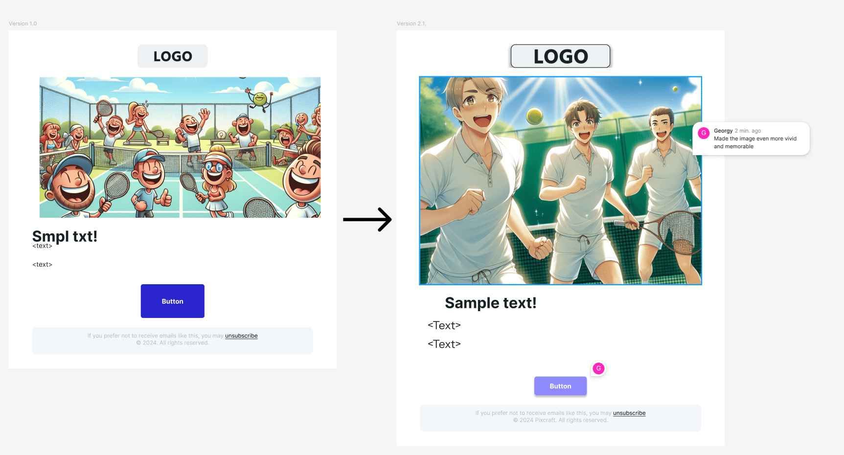
Creating an email template guideline in Figma is an investment in long-term efficiency and design consistency. Well-structured components and variants make the email-building process similar to assembling with "building blocks"—you quickly create an email from a set of pre-approved elements, modifying only what’s necessary.
This approach saves time, ensures a unified style, and simplifies future updates. By following these steps and continuously updating the guideline, you can maintain a high-quality, modern, and scalable email design. For even faster interactive email creation, you can use the Pixcraft Email plugin for Figma.