How to Increase Email Click-Through Rates with the Right CTAs
A CTA in an email is the button that leads subscribers to take action. If it’s hard to find, the text doesn’t stand out, or the button isn’t mobile-friendly, your email may go unnoticed.
It’s not just about choosing the right words—you also need to consider placement, design, and size. Even animation and white space around the button can impact results.
In this article, we’ll break down which CTAs attract more clicks, why bulletproof buttons are essential, and how to test different versions to find the most effective one.
How Many Buttons You Need and Where to Place Them
Email buttons should be clear and noticeable. If the design is confusing, users might not know where to click. A CTA should have an obvious look so that people immediately recognize it as a clickable element.
 There’s no button here, but the text is clickable. Users may not realize where to click to reach the website.
If an email has multiple buttons, they should be prioritized. Use one style for primary actions and another for secondary ones. Typically, two variations are enough to keep the structure clear without overloading the email with unnecessary elements.
 This email uses two types of buttons.
Too many buttons in a single email can confuse the reader. It's better to keep only the most important CTAs and arrange them in a way that makes the path to the desired action clear.
 This email is overloaded with buttons.
Which Wording Works Best?
The text on a button directly impacts click-through rates. A good CTA should be clear, attention-grabbing, and action-oriented. But should it be short or detailed, creative or straightforward?
Short vs. Long CTAs. Short CTAs (“Buy,” “View,” “Try”) are familiar and easy to read. They work well when the action is obvious, and the context is clear without extra words—especially when there's already an explanation before the button.
Longer CTAs (“Get Free Access,” “Choose a Plan and Subscribe”) can be more effective when users need extra reassurance. They work well for complex topics where additional motivation is required.
Short CTAs are more suitable for mobile emails since they are compact and easy to tap. Longer ones help convey the value of the action when necessary.
Clarity vs. Creativity. A unique CTA can grab attention, but if its meaning isn't clear, fewer people will click. For example, “Open the Door to the Future” sounds intriguing, but it’s not immediately obvious what happens when you click. Meanwhile, “Sign Up for a Course” is straightforward and easy to understand.
Creative CTAs work well when they align with the brand’s tone and are instantly clear. For an online store, for example:
- “Add to Cart” – clear and familiar
- “Save for Later” – a bit more creative but still understandable.
- “Stash Away” – fun, but might be confusing.
 The button is creative, but not everyone may understand what happens when they click.
What to Test?
- If a standard CTA isn’t delivering good results, test different variations: concise, detailed, or emotional.
- Use action-oriented verbs like “Get,” “Sign Up,” “Download.”
- Add urgency or a benefit: “Book with a Discount,” “Download for Free.”
- Avoid vague wording: “Okay,” “Next,” or “Done” without context can be confusing.
What CTA Buttons Should Look Like
Size
Buttons in mobile interfaces should be large enough to tap easily. A recommended minimum size is 44×44 px.
Buttons that are too small make users adjust their finger position, forcing them to tap with the tip instead of the pad. This slows them down and requires more effort. If buttons are too close together, accidental clicks become more likely—especially with larger thumbs.
The average width of an adult’s index finger is 1.6–2 cm (45–57 px), while a thumb is about 2.5 cm (72 px). Buttons of this size are easier to tap accurately, improving interaction speed.
 This button is large, making it easy to tap accurately.
Tablets allow for larger buttons, but mobile screens have limited space. If everything is oversized, you’ll run out of room. Finding the right balance—keeping only essential buttons—is key.
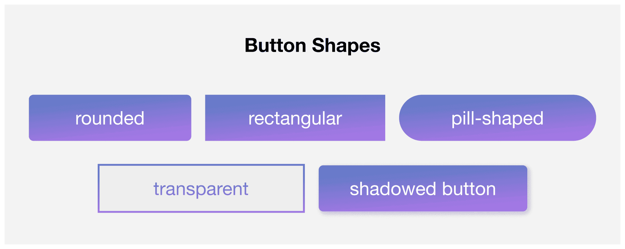
Button Shape
Experimenting with design is great, but if a button doesn’t look like a button, users might not notice it. It’s best to use familiar shapes:
- Rounded.
- Rectangular.
- Capsule-shaped.
- Transparent.
- Buttons with shadows.
Space Around the Button
A button should stand out, not get lost among other elements. To achieve this, it needs enough surrounding space. This is especially important on mobile devices—if buttons and links are too close together, users might tap the wrong one by mistake.
Visual Feedback
Simple animations make buttons more noticeable and enjoyable to use. Studies show that visual effects like these can increase click-through rates by 26%.
The easiest option is to add a response to hovering or clicking—such as changing color, slightly enlarging the button, or adding a glow. These small details draw attention and make interactions feel more natural.
Such enhancements engage users and improve email click-through rates. The key is not to overdo it—animations should enhance usability, not distract from it.
How to Choose the Best Button Design
Even small changes in button design or wording can impact click-through rates. But how do you know what works best? Testing is the only way to validate assumptions and find the most effective option.
What to Test?
When testing buttons, consider the following:
- Text — short vs. long CTA.
- Color — bright and high-contrast vs. neutral and design-friendly.
- Shape — classic rectangular, rounded, or capsule.
- Size — small vs. large and attention-grabbing
- Placement — at the beginning, middle, or end of the email.
How to Test?
You can use platforms that automate the process. For example, Altcraft Platform offers different testing formats:
- A/B Testing. Compares two button variations to determine the best performer based on clicks or opens. The system can automatically distribute the audience and select the winner.
- Multivariate Testing. Suitable for more complex experiments, such as testing multiple elements in an email at once. The platform allows up to 8 template versions.
- Analytics. If automatic selection isn’t enough, you can manually analyze reports to choose the best option.
What Are Bulletproof Buttons?
Bulletproof buttons are created using HTML and CSS instead of images (PNG, GIF, JPEG). Their key advantage is consistent display across all email clients, even if images are disabled.
Using image-based buttons comes with risks—if they don’t load, the CTA becomes invisible, reducing click-through rates. Additionally, editing image-based buttons requires redesigning, re-uploading, and updating the code. With bulletproof buttons, you can easily adjust text and styling directly in the HTML template.
Pixcraft automatically generates bulletproof buttons that display correctly across all email clients, including Outlook, and remain visible even when images are turned off. The block editor allows you to quickly create emails without extra hassle and prepare them for sending. Try the email builder for free.
If you don’t have time for manual email coding, the Pixcraft Figma plugin can help. Simply design your layout, and the plugin will convert it into clean HTML code—saving time and eliminating the need for manual adjustments.
Conclusion
For a CTA to be effective in emails, you need to consider the text, design, and placement. A clear message and a well-designed button in the right spot can significantly impact click-through rates. Instead of guessing, test different variations and analyze the data—this way, your email campaigns will deliver real results.