Responsive Design: How to Create Beautiful Emails That Display Correctly
Each year, more people are opening emails on mobile devices. If your email isn’t optimized for mobile, there’s a good chance it won’t get read. It’s crucial for your messages to look great and be easy to engage with, no matter what device your audience uses.
Let’s explore how to create emails that are easy to read and visually appealing on any device.
Approaches to Mobile Email Optimization
There are three main strategies for adapting emails to different devices—let’s dive into each one in more detail.
Scaling
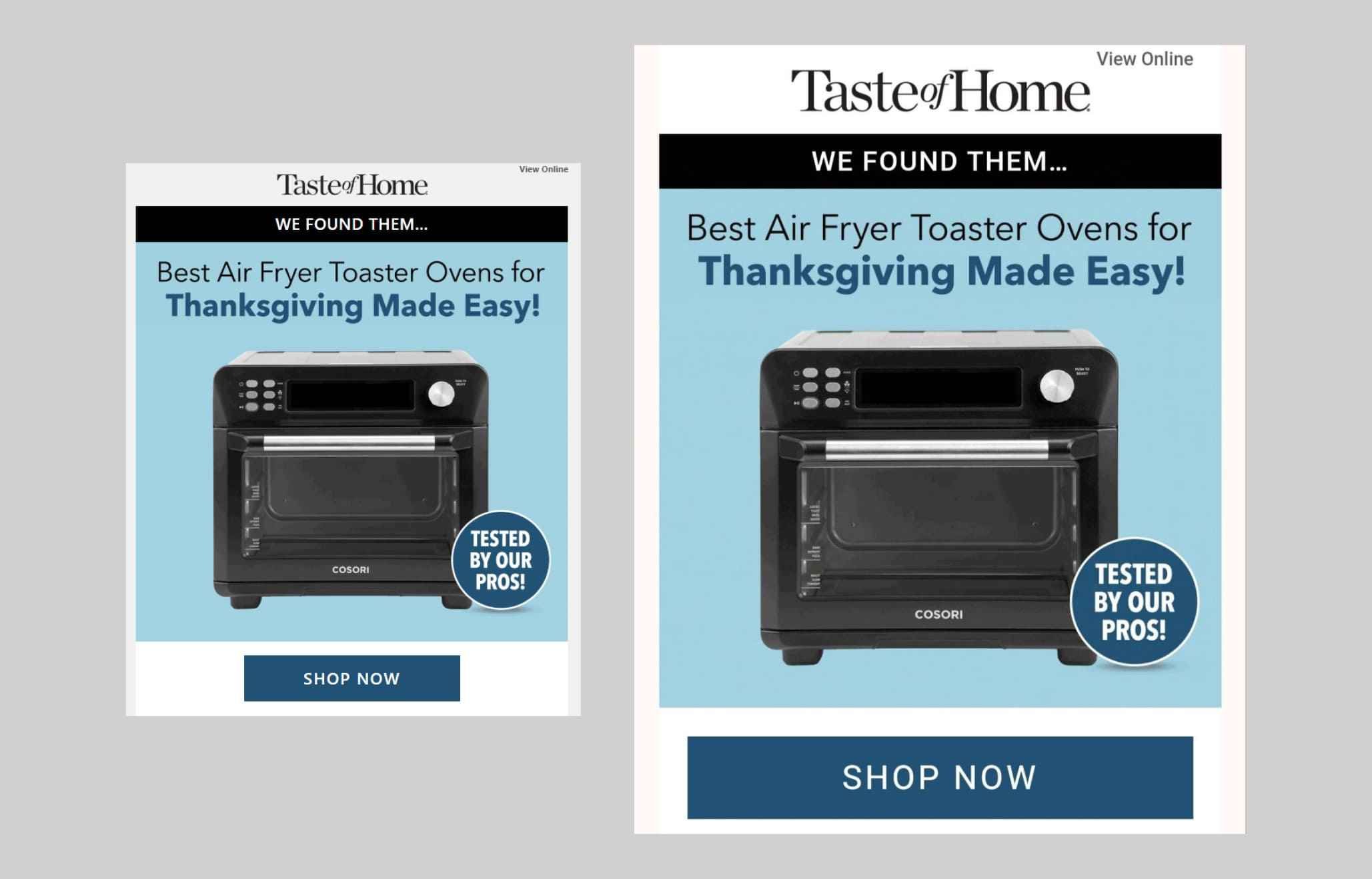
This approach works best for emails with a simple structure. It involves using relative dimensions with minimum and maximum size constraints, making it easy to scale images and adjust text blocks. However, it’s not well-suited for more complex layouts.
It’s crucial to ensure in advance that text and buttons on images are large enough. Even if their size is reduced by half, they should remain easy to read.
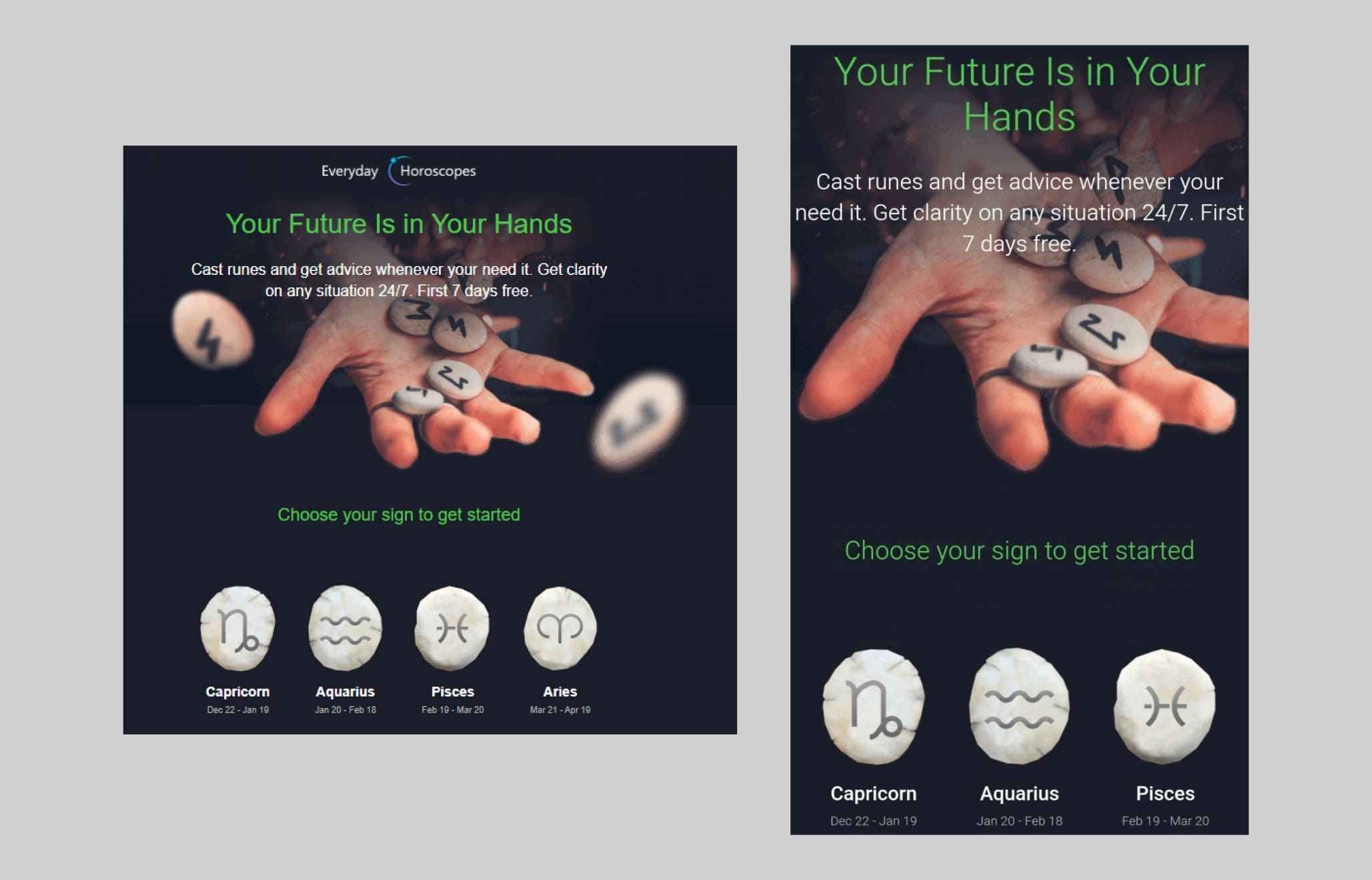
The scaling approach can also be applied to sections with background images. In this case, parts of the background on the right and/or left will be cropped—a technique known as "clipping." When used skillfully, this method can create an appealing effect by removing unnecessary elements from the mobile version of the email.
Media Query Adaptation
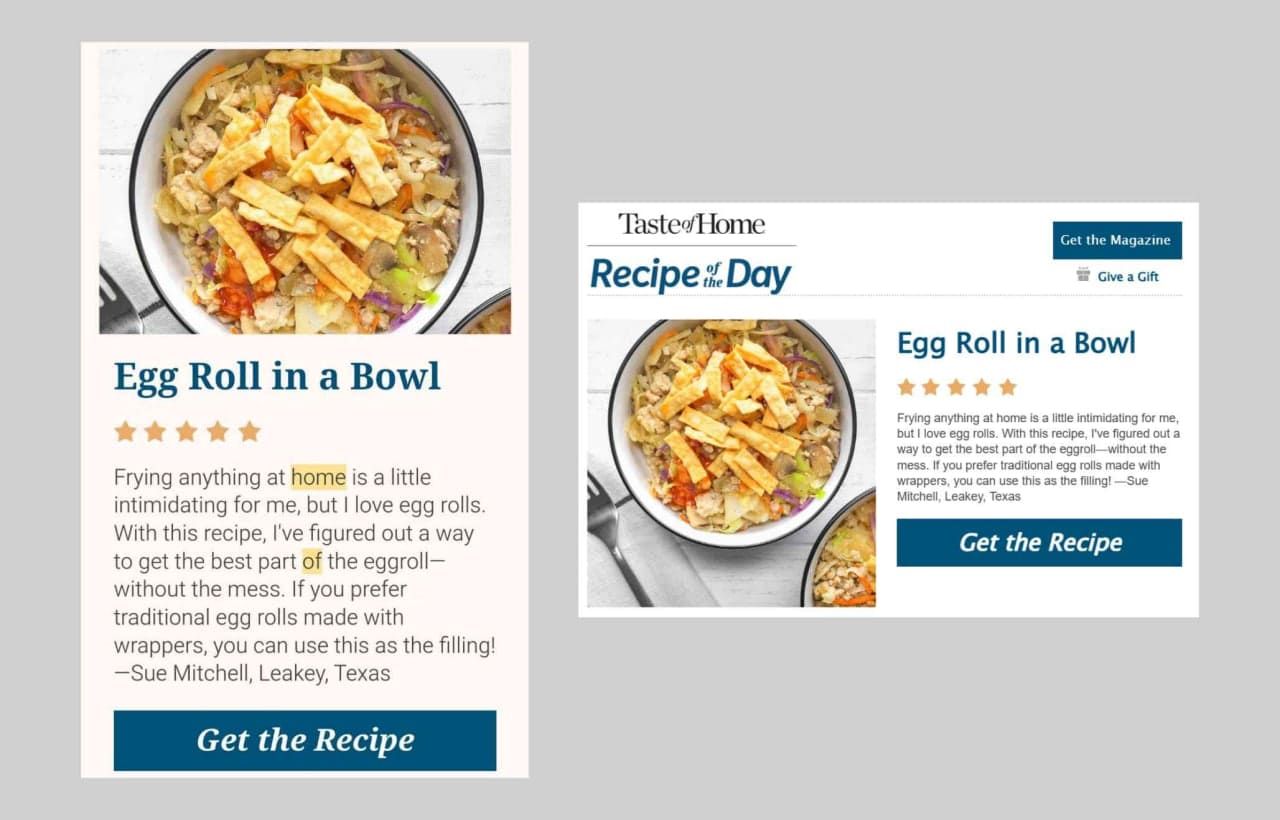
From a design perspective, this approach offers complete flexibility to adjust the structure and appearance of an email based on the device it’s viewed on.
With this method, you can create two separate layouts: one for desktop and another for mobile devices. For wide-format emails, you can even design a version specifically for tablets, if needed.
However, despite its clear advantages, this method has a significant drawback—media queries don’t work in some email clients.
Block Adaptation
This method allows for the adjustment of any email elements placed in adjacent table cells. When the device screen isn’t wide enough to display all cells in a single row, the elements shift—one cell drops below the other.
If a row contains more than two cells, the restructuring happens step by step: first, the outermost cell moves, then the next one, and so on. You can control this by adding extra wrappers around blocks that need to adjust together. For example, in a four-column layout, it’s better to group the content into two blocks with two cards each.
In a three-column structure, it’s important to avoid large gaps between elements. Otherwise, on mobile devices, empty spaces may appear on the left and right sides of the blocks, which can look unappealing.
If the design includes a block combining text and an adjacent image, adjust the structure so that the text moves below the image. This makes the mobile layout more intuitive and user-friendly, resembling a standard article or product card format. For desktop layouts with a staggered (checkerboard) arrangement, this effect can be achieved through reverse block restructuring.
Align adjacent blocks by width so that they occupy equal portions of the space—for instance, half the width of the email. This way, after restructuring, the elements will stack neatly on top of each other, even without using media queries.
If you don’t have time for mobile optimization, try the visual email builder Pixcraft. It offers responsive and adaptive design that displays correctly even without media queries.
Which Approach to Choose
Each approach has its limitations and works best for specific email structures. Therefore, the optimal solution is to combine these methods to achieve the best possible display across most email clients.
For instance, a less-than-ideal three-column structure with block adaptation can be improved by using media queries to increase the width of the cards on mobile devices, making them span the full width of the screen. Similarly, block restructuring can be combined with the clipping technique to trim not just background images but also unnecessary elements, like an extra illustration block, so that the CTA fits within the first screen view.
Key Considerations for Email Design
When adapting emails for mobile devices, it’s important to ensure not only that the content fits well on smaller screens but also that it’s easy to interact with.
Buttons. The main difference between using mobile devices and computers lies in how users interact with the screen: mobile devices rely on touch, while computers use a mouse and cursor. Even if your call-to-action button is visually appealing, a tap area that’s too small will reduce click-through rates.
The recommended minimum size for tappable areas is 44x44 pixels. In some cases, it’s worth making buttons even larger—such as spanning the full width of the screen—to make them easier to tap with a thumb.
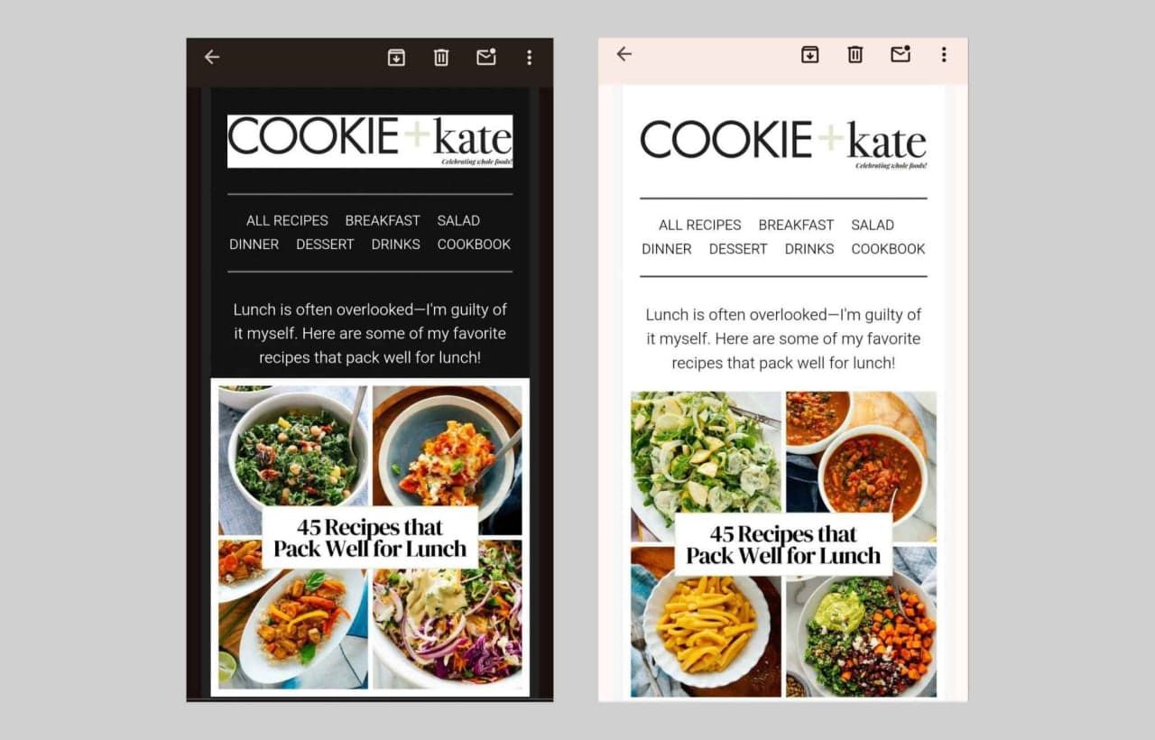
Dark mode. When an email with a light background automatically switches to dark mode, the brightness is inverted: the background becomes dark, and the text turns light. For emails with dark backgrounds, inversion usually doesn’t occur—except in Gmail on iOS.
Graphic elements typically remain unchanged, which is important to consider when using a dark logo on a light background or including header text as an image.
Retina Optimization. The term "Retina display" originally referred to Apple products, but it is now often used for any high-pixel-density screens. To ensure images look sharp on these screens, they should be saved at a larger size—at least double their intended display dimensions.
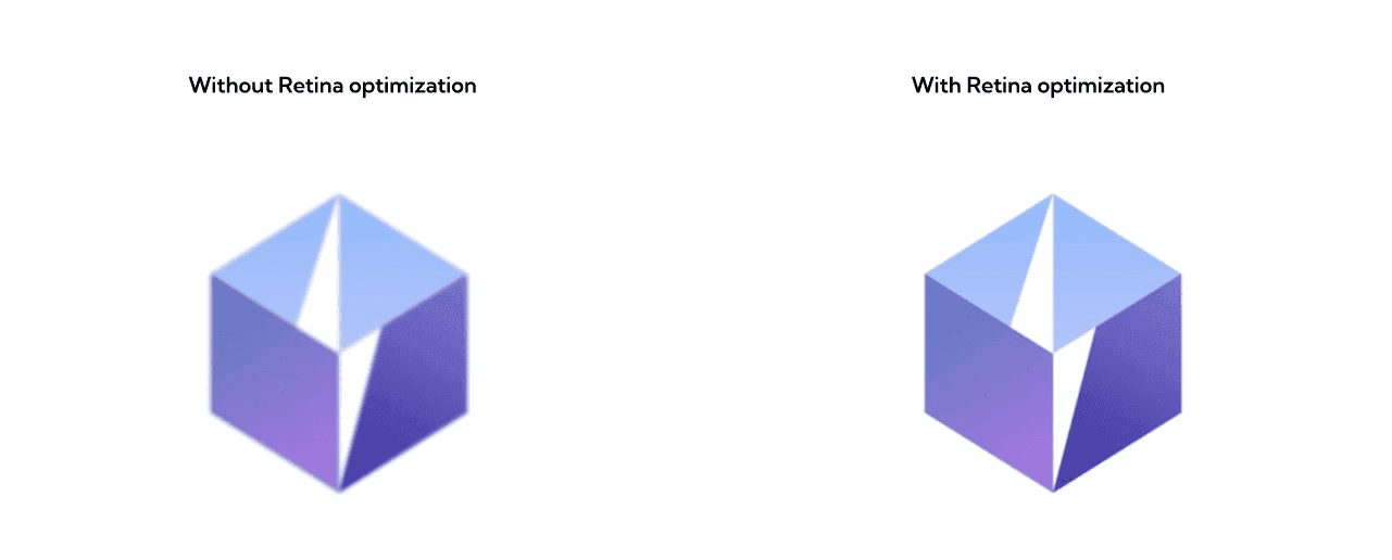
However, this increases file sizes, slowing down email loading times. Therefore, it’s best to use this technique for simple graphics with fewer colors, such as logos or icons. To optimize file sizes, you can use compression tools like TinyPNG or iloveimg.
Conclusion
Responsive design isn’t just a trend—it’s essential for successful marketing in today’s tech-driven world.
Well-optimized emails that accommodate different devices and screen sizes enhance engagement and improve the overall experience for your subscribers.
