Email Typography: How to Make Your Text Easy to Read
Why do some emails immediately grab attention while others get ignored? It’s not just about the content and images — the visual presentation of your text plays a major role.
Typography isn’t just about picking beautiful fonts — it’s an entire approach to presenting text visually. The way you use fonts to emphasize certain parts directly affects how your email is perceived and how effective it is.
In this article, we’ll explore which fonts are best for emails, how to choose them, and how to avoid common mistakes that can cost you your readers' attention.
Types of Fonts for Email
Sans-serif fonts — like Arial, Helvetica, Verdana, and Tahoma — appear modern, neutral, and are easy to read on all kinds of screens. Their biggest strengths are readability and versatility. These fonts are ideal for business emails, newsletters, and any communication that prioritizes clarity and accessibility. For body text, Verdana or the more neutral Arial are especially recommended.
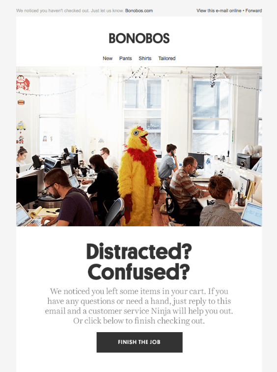
 The body uses a standard sans-serif font — Arial
Serif fonts, like Georgia and Times New Roman, give off a more formal, classic vibe. Serifs add a sense of seriousness to the text, which is helpful in official communications or projects where a traditional brand image is key. However, be aware that serif fonts can reduce readability on small screens.
 The body uses a serif font that resembles Georgia or Times New Roman
Script fonts like Pacifico, Dancing Script, or Lobster bring a casual, emotional feel to emails. They create a sense of personal connection and can boost engagement. That said, script fonts can significantly reduce readability in longer texts, so use them sparingly — only for small accents like headings or short inserts. They are not suitable for body text.
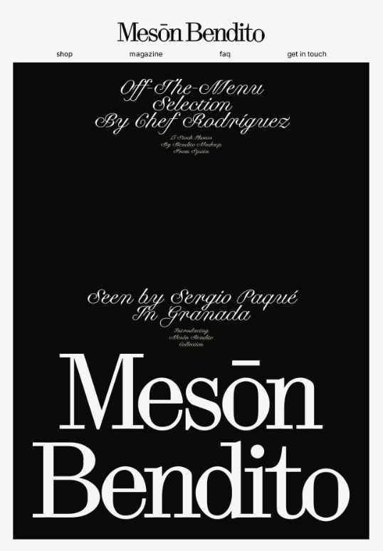 This email uses a modern serif (like Canela) and an elegant script font (like Bickham Script Pro)
Decorative fonts (e.g., Impact, Comic Sans, or custom branded typefaces) are designed to attract attention through their unique appearance. They may be suitable for banners, holiday headers, or special promos. But for business emails or long texts, they’re a no-go: they quickly become hard on the eyes and make the content harder to absorb.
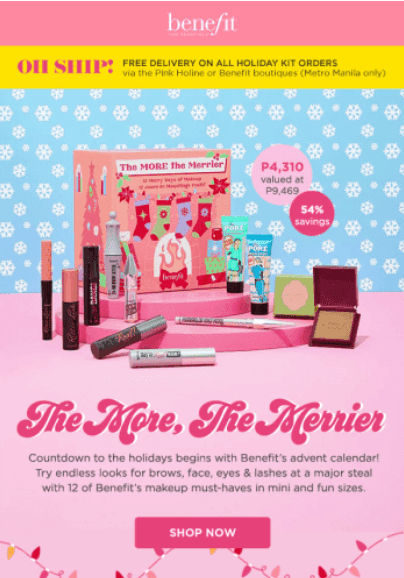 A decorative font is used in the header
Standard vs. Custom Fonts
Standard (web-safe) fonts are fonts that come pre-installed on most major operating systems: Windows, macOS, Android, iOS. These fonts render correctly across nearly all email clients without any special setup. Common web-safe fonts include Arial, Verdana, Tahoma, Times New Roman, and Georgia. They guarantee consistent appearance, fast loading, and minimal risk of display issues.
Custom fonts, on the other hand, require special inclusion using @font-face or services like Google Fonts. Support for these fonts is extremely limited — they only work reliably in Apple Mail (iOS and macOS) and some versions of Outlook for Mac. In most other cases (e.g., Gmail, Outlook on Windows, mobile apps), the custom font gets replaced by a fallback. This not only breaks the intended design but can also mess up layout.
Using custom fonts in email is only justified in rare cases when you know exactly what email clients your audience is using.
@font-face is practically useless in email design today — with support in less than 20% of clients, it’s not a viable option. If you try to use a custom font without a fallback, your email may look broken.
The only truly reliable solution is to stick to web-safe fonts. They ensure fast loading, consistent display, and meet the basic UX standards for email design.
There’s one important exception: if you’re using an image (like a banner), you can use any font you want — since it’s a picture, not live text, it will render correctly. This is a good way to preserve brand style, but keep in mind that if the recipient has images turned off, that part won’t load.
How to Combine Fonts
Using more than two fonts in a single email is not recommended. The ideal combo: one font for the body text and one for headers. For example:
- Georgia for headers and Verdana for body text — gives a classic touch.
- Arial for headers and Times New Roman for body — formal, professional look.
- Trebuchet MS for headers and Arial for text — clean, modern, and very readable.
Font Size, Line Height, and Contrast: Key Rules for Readable Emails
Header size should be much larger than body text. Go for 28–36 px for main headers and 18–24 px for subheaders. This creates clear visual hierarchy and helps guide the reader’s attention.
 The headline email appears to be set at approximately 32–36 px
The ideal font size for body text is 16 px. It’s readable on both desktop and mobile. Anything smaller hurts readability and risks being skipped over.
Line height is just as important. Even if your font size is correct, cramped lines are hard to read. A line height of 1.4–1.6 times the font size works best. For 16 px font, use around 22–24 px for line spacing. This makes the text breathe, improves readability, and reduces eye strain.
 Line-height about 1.4–1.5
Text and background contrast is essential for readability. Low contrast makes text hard to follow and easy to ignore. Dark text on a light background — black on white or dark gray on light gray — is the safest bet. Avoid low-contrast color combos and thin, light-colored fonts on bright backgrounds.
Practical tip: Your email text should be easy to read even when someone scrolls quickly on their phone. Always test readability on different screen sizes before sending.
Other Details That Make a Big Difference
Good typography isn’t just about fonts and spacing. These basics also have a big impact on the look and feel of your email — even if you don’t notice them right away.
- Awkward line breaks for short words. While English typography doesn't strictly forbid prepositions or conjunctions at the end of a line, breaking after very short words like “a,” “an,” “in,” or “to” can look unbalanced. If you’re coding your emails manually, consider using non-breaking spaces to keep these words together with the next one. Tools like Pixcraft and the TJML framework help automate this for a cleaner, more polished layout.
- Digit grouping. Large numbers like 10,000 or 1,200,000 should always include commas — it makes them easier to read.
- Punctuation. A hyphen (-) is not the same as an em dash (—). Use the em dash for pauses and emphasis. And for quotation marks, American English uses “curly quotes.”
- Text alignment. Keep text, buttons, and images consistently aligned — ideally to the left. Don’t justify text — it creates awkward gaps between words and makes it harder to read.
- Text color. Your main text should be a neutral dark tone — black or dark gray on a light background. For headers or highlights, one or two accent colors are okay, but avoid going overboard. Too much color clutters the layout.
- Text emphasis. Bold and italic are great for short emphasis — like promo codes or important points. But use them sparingly. If everything is bold, nothing stands out.
Final Recommendations
- No more than two fonts. One for headings and one for body text. Any more than that makes the email look cluttered.
- Font size should be 14–16 px. Anything smaller becomes hard to read, especially on mobile devices.
- Let the text breathe. Use a line height of 1.4–1.6. This keeps lines from crowding together and makes the content easier to read.
- Dark text on a light background. The most reliable option is black or dark gray on white. Complex color combinations reduce readability.
- Don’t use text as images. These emails can’t be read by screen readers and may not load properly.