
Mobile Email Adaptation: How to Ensure Proper Rendering Across Different Devices and Email Clients
In 2026, over 55% of emails are read on smartphones and tablets. This means that email campaigns must remain visually solid and structurally sound on both desktop and mobile devices.
But how do you craft email templates that adapt correctly to different screen sizes and devices? And what factors should be considered to ensure that these templates render equally well across various email clients? Read this article to find out.
What Specifics Should Be Considered When Adapting Emails
Unlike browsers, whose rendering engines have largely evolved according to mostly unified standards, email clients represent an extremely diverse environment. The rules and limitations here may vary drastically, and classic adaptation methods won't always work as expected.
Media Queries
In web development, media queries are the cornerstone of adaptability. They allow you to change how content is displayed depending on screen width, orientation (portrait or landscape), pixel density, and color scheme (light or dark). For example, it’s possible to switch from a two-column layout to a single-column layout at a certain window width.
However, when it comes to email clients, the situation is quite different. Not all clients work properly with media queries: some support media queries only partially while others do not support them at all. Therefore, media queries should not be considered the primary adaptation mechanism in professional email coding.
Two of the most prominent examples are Yandex Mail and the mobile web version of Gmail. Media queries do not work here, so an email that relies strictly on those might lose adaptability (and sometimes readability).
Mobile First Approach in Emails
The Mobile First approach deserves a special mention. Its core idea is that the email or a webpage is initially coded with smaller screens in mind and then adapted for desktops and laptops using media queries. In email design, for instance, the MJML framework uses this approach.
But if media queries aren’t supported, the desktop view will display the mobile version of the email. For example, you may encounter this problem when opening a campaign in Yandex Mail. Therefore, relying on the Mobile First approach (especially for email campaigns in Russia) is not the best option.
How Does Reliable Mobile Adaptation Work
For proper mobile adaptation, a suitable option would be the “table-block” approach combined with careful, targeted use of media queries. In short, this approach works as follows:
- table structures form the backbone of the email;
- adaptive blocks inside tables are implemented using CSS properties that most email clients understand;
- media queries are used only for cosmetic improvements;
- conditional comments provide a fallback structure for Outlook.
Let's break down each layer of this approach.
Tables as the Foundation
A table structure (<table>) behaves predictably in email and is supported by the majority of email clients. Tables define the external grid of the email: width, placement of main sections, background colors.
By default, the table structure describes a desktop layout that should display if adaptation does not occur. Thus, in environments lacking media query or modern CSS property support, the recipient is guaranteed to see a correct desktop layout.
Blocks for Adaptation Without Media Queries
The main ingredient enabling mobile rearrangement even in the absence of media queries is a simple div with the attribute:
style="display: inline-block"
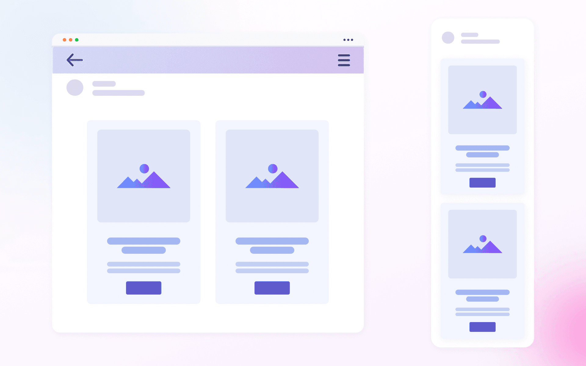
Elements with inline-block align horizontally as long as there is enough width in the parent container. If space is insufficient, the last element wraps to the next line. This approach works reliably in Yandex Mail, the mobile web version of Gmail, and other email clients.
In practice, basic mobile adaptation looks like this.
Suppose the desktop version of an email has two columns of 300px each with no margins. They fit inside a 600px wide container. But in a mobile client, the available width might be, say, 430px. Here, the columns no longer fit side by side and instead automatically stack vertically.
Media Queries as a Fine-Tuning Layer
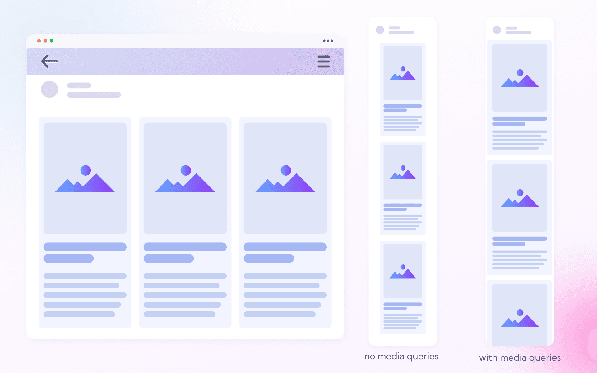
Sometimes after rearrangement, blocks retain empty space on the left or right. This happens because the blocks do not stretch on their own; instead, they retain the width originally set for the desktop.
In this situation, media queries can help. They allow you to:
- change block widths to 100% so they fill the screen evenly;
- adjust alignment (for example, switch from left to center alignment);
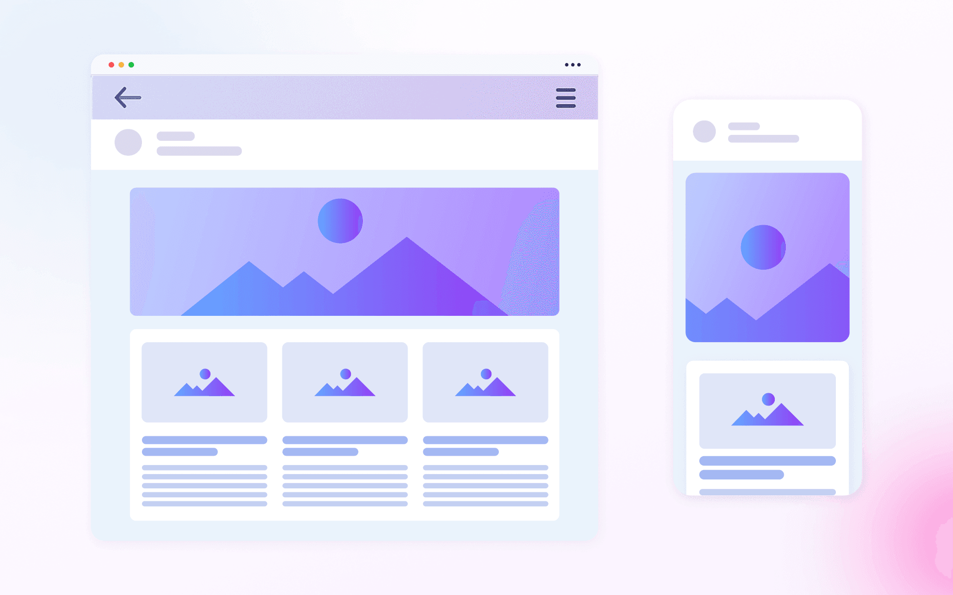
- hide or swap elements (e.g., show a horizontal banner in the desktop version and a square one on mobile when the media query triggers);
- transform margins and paddings: collapse unnecessary gaps, turn horizontal dividers into vertical ones.
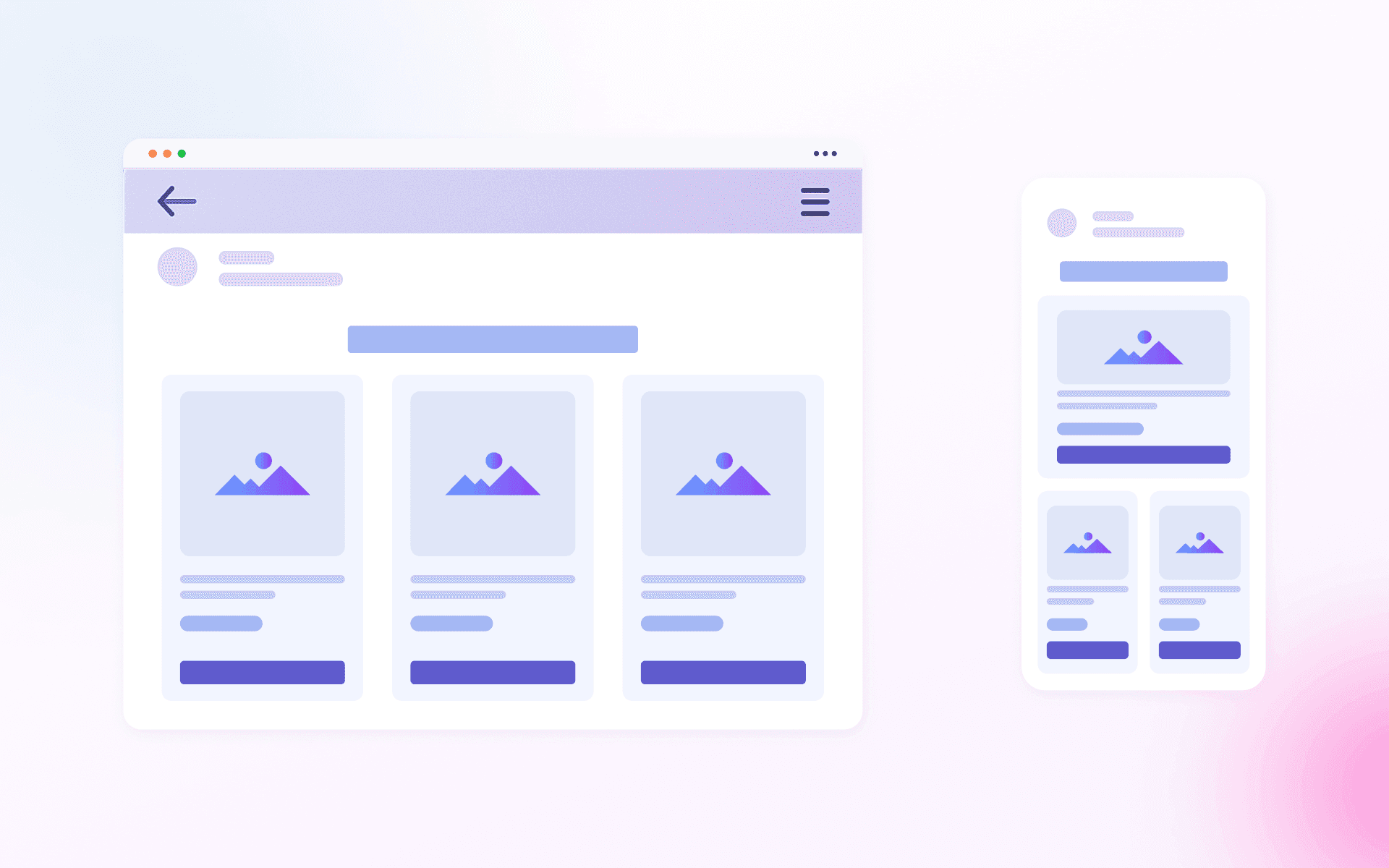
It is also crucial that in case media queries are not supported, the recipient will see the "basic" adaptation of an email: slightly less polished, but still fully functional.
Conditional Comments for Outlook
Although desktop Outlook is not directly related to mobile email coding, it may become an important factor for splitting the desktop display logic and the mobile adaptation logic into two parallel tracks.
The reason is as follows:
- Outlook renders emails using the Word engine, which ignores most CSS properties necessary for adaptive behavior.
- Consequently, classic content rearrangement methods (such as
inline-block,float,flex, andgrid) either work unpredictably or do not work at all.
For the B2B segment, where Outlook is one of the most widely used email clients, a loss of quality can be critical for the entire communication flow.
This requires an approach where desktop Outlook receives a separate structure, while other email clients work with adaptive blocks. To correctly render complex elements here, special code fragments — conditional comments — are used:
<!--[if mso]> ... <![endif]-->
Inside them, part of the structure is usually built using tables: for example, a multi-column block that relies on inline-block in other clients is broken down into a separate table row with cells.
Simply put, desktop Outlook receives a simplified, fully table-based layout and renders it reliably and predictably. The other clients ignore the conditional comments and work with the block-based model.
How Margins and Paddings May Behave On Mobile (and What to Do About It)
The problem with margins and paddings arises because the same layout is implemented in three versions: a block-based version with inline-block (basic adaptation), an enhanced block version with media queries, and a table-based version for Outlook.
Suppose the desktop email has two columns. The left column has a right padding (padding-right).
- In the table-based layout for Outlook, the padding works correctly.
- On mobile, columns stack vertically. The right padding of the left column persists, which leads to extra empty space to its right.
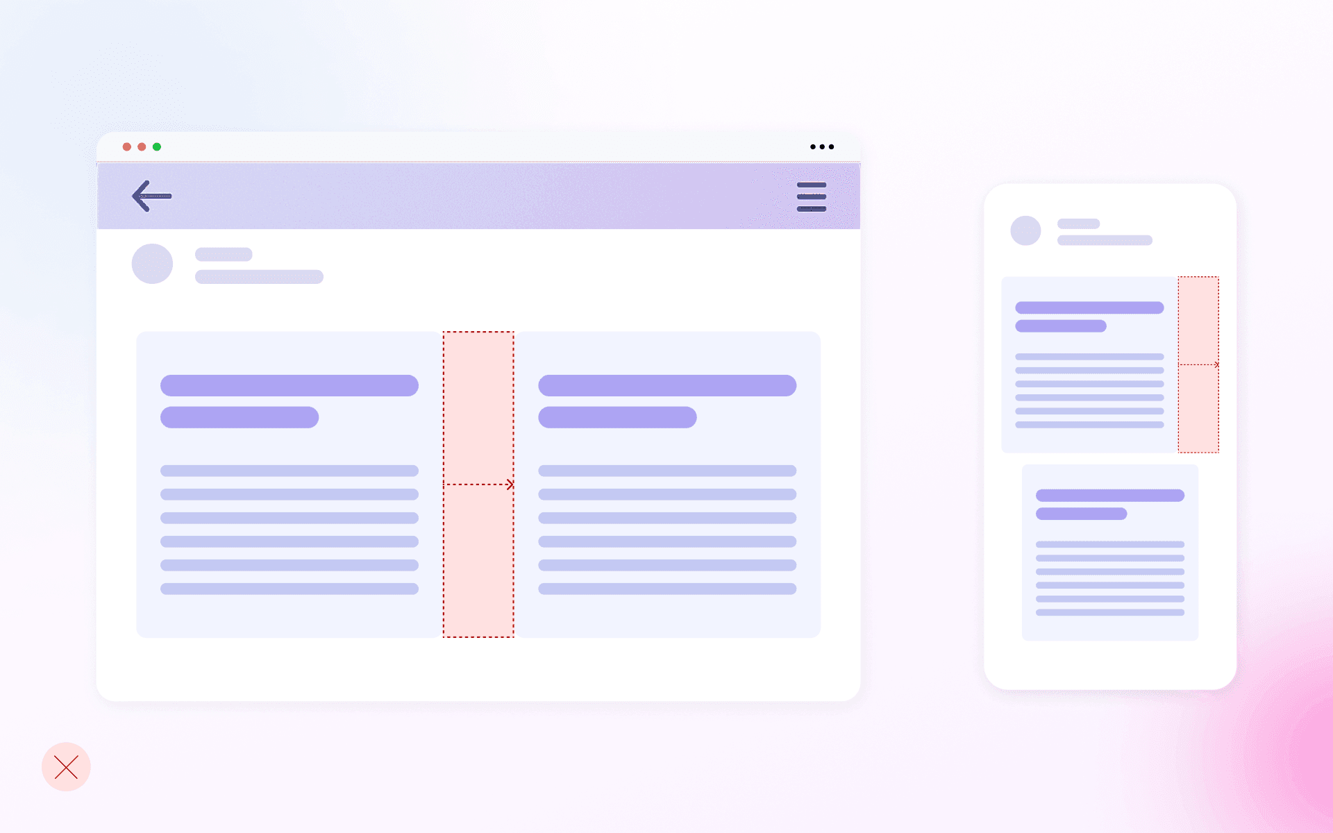
There are three solutions here:
- Make the paddings symmetrical: add equal left and right paddings to each element (e.g., product cards) and set center alignment on the parent element. In this case, blocks will be centered when they wrap.
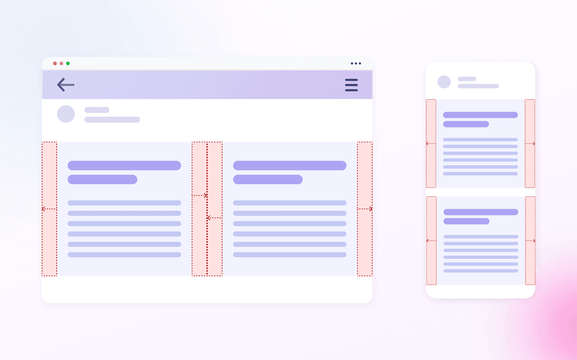
The downside here is that the cards won’t take the full screen width and will not touch the left and right edges: margins will always remain on the sides. Therefore, this solution works only in cases where the design permits it.
- Keep the asymmetrical right padding and set left alignment. In this case, the rearranged blocks will align to the left edge, and the "extra" padding will simply remain to the right, preserving a uniform content width.
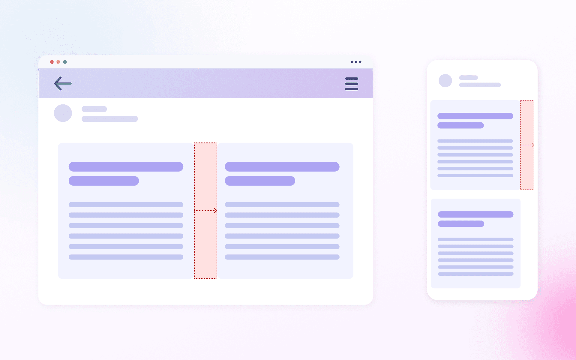
- Remove the padding in the mobile version using media queries. However, this is not the most reliable method because if the email client does not support media queries, the padding will remain.
How Mobile Adaptation Works for AMP Emails
The AMP for Email technology is supported only in modern email clients, such as Gmail and Mail.ru. AMP emails do not require special workarounds: almost all CSS features are available here, including flex, grid, and media queries.
The use of tables in AMP essentially serves no purpose: they bloat the markup and make maintenance harder. At the same time, semantic block-based layouts offer both flexibility and performance.
It should be noted that AMP does not eliminate the need for a classic HTML fallback. Including an HTML version within an AMP email is a mandatory requirement.
How Mobile Adaptation of Email Templates Works in Pixcraft
Automatic email adaptation is implemented in the Pixcraft email builder. We combine approaches depending on the selected adaptation mode. As a result, blocks rearrange neatly without losing visual structure even when media queries are not supported.
For email clients that support media queries, the editor provides various adaptation scenarios. For example, you can:
- set columns to stretch to full screen width or keep them unstretched after rearrangement;
- choose more complex rearrangement schemes (e.g., place one column with stretching into a separate row, and two other columns below it without stretching).
Conclusion
In email coding, adaptability is built using several layers. First, you lay the most reliable foundation that works for the majority of email clients, and then add enhancements for clients with broader capabilities. This strategy ensures predictable results across different devices and email clients.
The Pixcraft email builder follows these principles in its operational logic. Try it for free for 14 days and see for yourself. And if you'd like to learn more about Pixcraft, feel free to contact us.