Pixel-perfect in Email Design: Is It Achievable (and Worth the Effort)?
Pixel-perfect is an approach where the layout precisely matches the design mockup, and every element looks and behaves as originally intended. Over the years, this principle has become a symbol of precision and respect for detail in web design.
But is it actually possible to achieve absolute alignment between the initial design and the layout when creating email templates? And is it even worth striving for? In this article, we'll explore the line between precision and excessive pursuit of perfection, and why pixel-perfect doesn’t always guarantee quality in email campaigns.
The Origin of the Pixel-Perfect Approach
This principle originated back when responsive design didn’t exist yet, and websites were built with fixed screen resolutions in mind. If a webpage looked exactly as it did in the mockup, it was considered perfectly accurate.
However, the situation changed over time. Mobile devices evolved, pixel density increased, and dark themes emerged. Ultimately, the adaptive approach evolved into responsive design. Instead of mathematical precision, visual consistency and readability on any screen became paramount.
Why Pixel-Level Precision Shouldn’t Be Treated as a Standard in Email Design
At first glance, the internal structure of an email may resemble a web page: HTML code, tags, styles. But in practice, it's a different environment with its own set of rules and limitations. While browsers have been moving toward standardization for decades (HTML5, CSS3, unified rendering engines), email services have evolved independently.
Different email clients rely on their own engines, and support for modern standards isn’t always guaranteed:
- Gmail partially filters CSS styles. This helps protect users from potentially malicious code, but sometimes distorts the appearance of emails.
- Yandex Mail completely removes media queries from emails. Therefore, responsive layouts may not adapt as intended.
- Outlook for Windows uses the Microsoft Word engine, which doesn’t support many CSS properties.
Fonts in emails may also behave differently. For example, Helvetica is available by default in macOS but not in Windows. Arial is the system font for Windows, yet it’s missing on Android. When the desired font isn’t available, a fallback or default font is used instead. As a result, text size, spacing, and other parameters may slightly increase or decrease.
Sometimes the discrepancy is just a few pixels and is barely noticeable. However, in complex layouts, when these deviations accumulate, the grid becomes unbalanced. As a result, columns and visuals may misalign.
Simply put, the pixel-perfect approach doesn’t work in emails because of the very nature of the email environment. Creating a template that looks absolutely identical across all systems and email clients is technically impossible without imposing strict limits on structure and design.
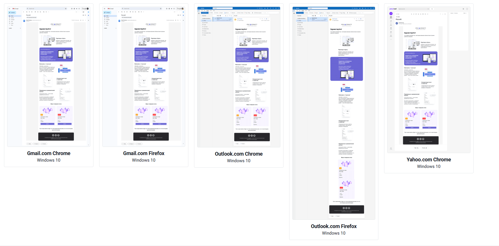 How the email renders in different email clients
When the Pursuit of Perfection Hinders Perception
Imagine a standard product card with a title, description, price, and a “Buy now” button. The designer set perfect margins, a fixed block height of exactly 320 pixels, and complete symmetry.
In the mockup, everything looks flawless, but after a test send, the email starts to behave differently:
- In Gmail, the description text wraps to two lines, and the button shifts down.
- In Outlook, border radius doesn’t work.
- On Android, the system font is slightly larger, making one card appear taller than the others.
Sure, the text in the email is still legible, and the button performs the required action. But from a pixel-perfect standpoint, all of the above is a failure. Attempts may be made to restore the original appearance by using restrictions:
height: 320px
overflow: hidden
However, this solution introduces new risks, especially for mobile layouts:
- text may be cut off;
- the button may extend beyond the container;
- the background may no longer align with the interface elements.
Pixel precision for its own sake doesn’t improve the quality of emails. Users don't examine emails under a magnifying glass, don't measure margins, and may not even notice minor discrepancies. It's far more important for them that the email is easy to read, its message is clear at a glance, all key elements are visible, and no manual zooming is required.
Realism Over Dogma: How to Approach Email Layout Rationally
The main task of a layout designer is to ensure that emails look neat and are easy to read in every email client. To achieve this, the development process itself should use a different approach, taking into account the differences in how various email clients render content.
The goal is not absolute similarity but consistency in different conditions, even if some details differ slightly:
- For the desktop version, the layout should stay as close to the original design as possible, but it's important to allow for a small amount of space and avoid creating a tight grid. Blocks should retain their shape even when the font or content changes. This is especially important in emails with dynamic content, where the length and amount of text may vary.
- The mobile version should remain comfortable to read even without media queries. This ensures layout stability in email clients that don’t support them.
- Media queries should be used to enhance the appearance, not to control structure. If supported by an email client, the message becomes more user-friendly, but the core logic must remain consistent even without them.
The focus should shift from precision to stability. It’s a more practical and pragmatic way to design emails: the layout doesn’t replicate the mockup pixel by pixel, but stays balanced and easy to read in a variety of scenarios.
How Pixcraft Helps Maintain Visual Consistency
At Pixcraft, we take a realistic approach: the email environment is complex, but the results can still be kept under control. We offer tools that help maintain layout precision and stability in a wide range of conditions.
TJML Framework
For those who prefer manual coding, the Pixcraft team has developed TJML, a free email framework that speeds up template creation and provides several key advantages:
- layouts are responsive by default while keeping the code clean and compact;
- messages render correctly even in email clients that don’t support media queries;
- AMP and HTML versions of an email are generated from a single codebase;
- typographic rules for texts in Russian are applied automatically.
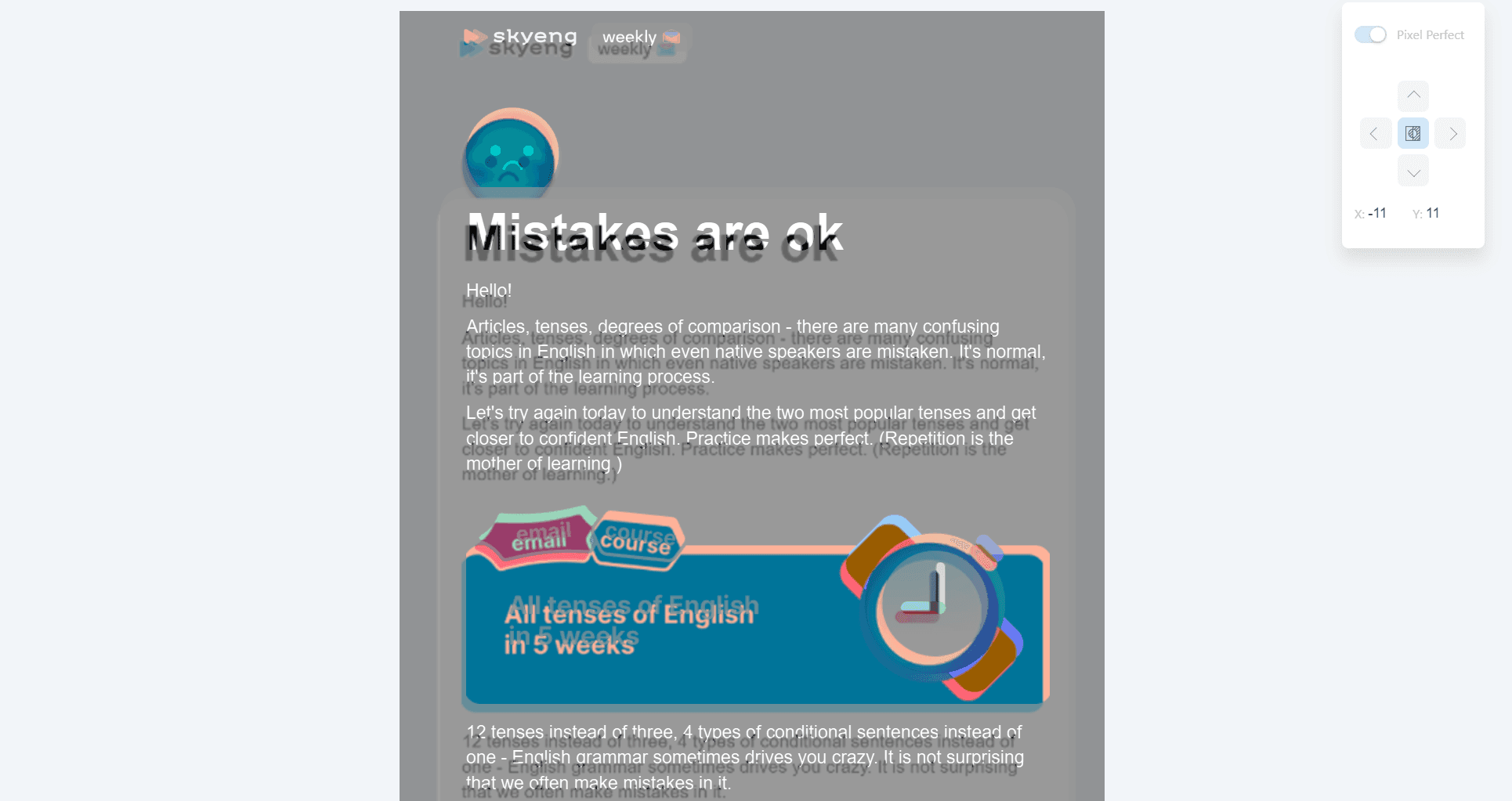
The built-in Pixel Perfect tool makes it possible to compare a ready-made template with a reference image. It’s especially useful when you need to ensure that the email matches the original design closely, but with just enough margin to maintain layout stability. This makes it easier to maintain accuracy even in emails with complex designs.
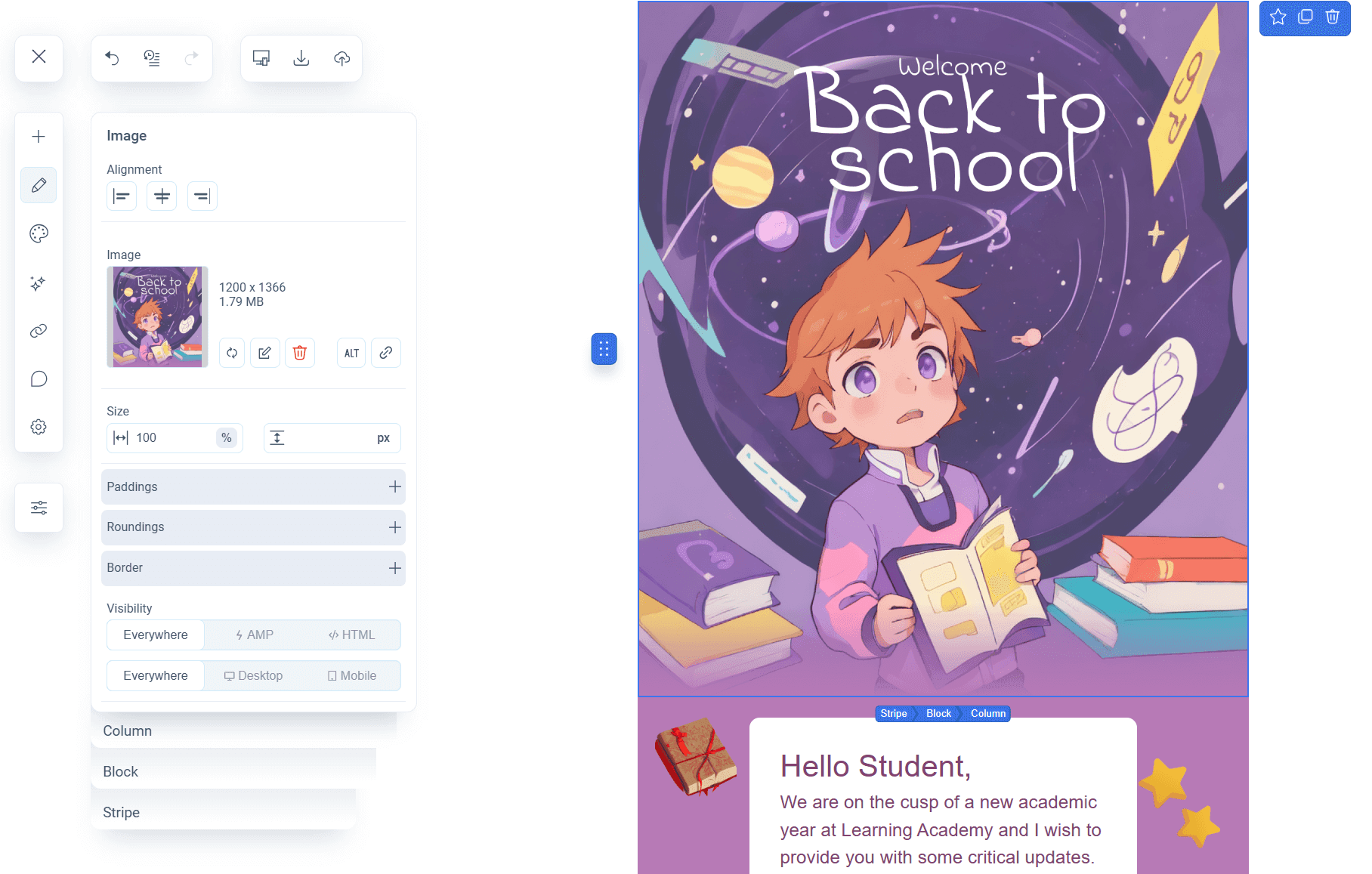
Visual Email Builder
Pixcraft is an email template builder that combines visual simplicity with engineering precision. You can create and edit an email without writing a single line of code, and then immediately preview how it will look:
- on desktop and mobile devices with different screen resolutions;
- in light and dark themes;
- with or without interactive AMP elements.
When working with email templates, the builder takes into account the specific features of various email clients. As a result, it’s much easier to maintain layout logic.
Predictable Results
Pixcraft is built around the idea of visual consistency: an email should preserve its structure and layout quality even when the environment changes. Instead of trying to chase pixel-perfect accuracy, the focus remains on what truly matters: a clean, logical, and predictable design that works reliably in real-world conditions.
Conclusion
Pixel-perfect is an elegant and noble idea, but not a universal one. The true quality of an email campaign is defined not by how precisely it matches the initial mockup, but by its consistency and stability.
In particular, a good email:
- remains readable without media queries;
- maintains its structure even when fonts change;
- looks equally clean and consistent in Gmail, Outlook, and on mobile devices.
That’s the essence of a professional approach. The most effective direction in email development isn’t strict pixel perfection, but a pragmatic method with a flexible, well-thought-out layout that accounts for the nuances and pitfalls of different email clients.